“Denton Family Dentistry”
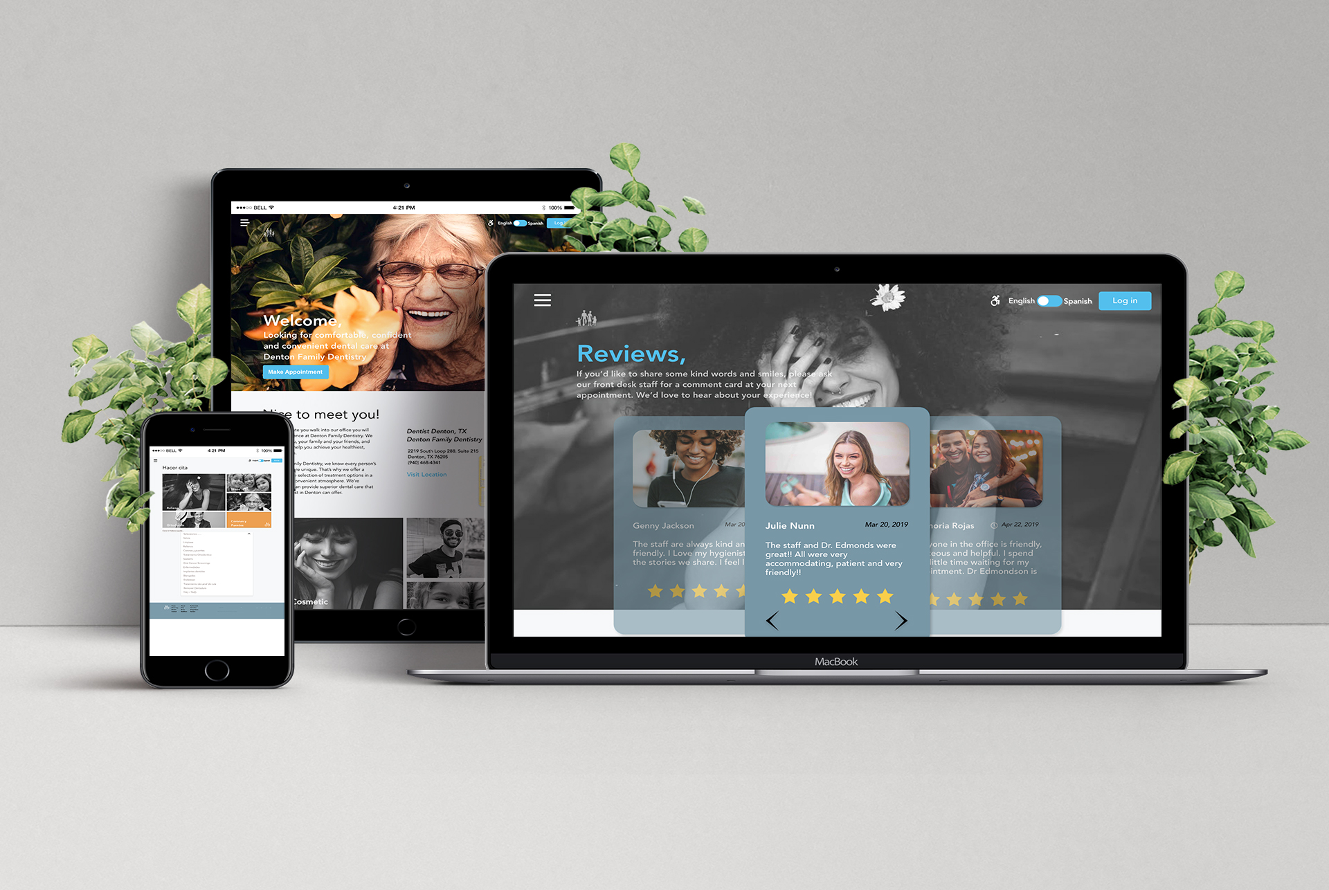
Denton Family Dentistry Website
Redesign
My Roles
- UX Designer & Research
- UI Design
Project Background
Denton Family Dentistry is a local business in Denton, TX that provides specialized dental services. Since their targeted audience is families, they hope to redesign their website to attract more clientele. The decision was made to redesign both their web and mobile interfaces. The client’s terms state that we were not allowed to rebrand, we must keep the functionality of their accessibility tab, and continue to display their social media handles.
We researched and analyzed the current website’s visual rendering as well as their information architecture. Pain-points were highlighted such as the lack of contrast which creates difficulty in reading, excessive content, complexity of tasks completion, and lack of action confirmations. To inform the re-design, three different personas were created in order to provide a sense of how users would navigate the site. One was represented as an elderly man, another a native Spanish speaker, and the third a young college student. Finally, we prototyped 7 tasks we felt would be crucial in the redesign of the site and that are quite common across any user’s experience with dentistry.
Task And Mission
- Re-design Denton Family Dentistry into a responsive website facilitating ease of use
- Give their end-clients an easy and inviting way in which to book appointments online, while still providing contact information for those who would prefer to call
- Improve the overall flow of the site
- Ensure accessibility and Section 508 compliance
- Transform the site into a showcase item that becomes a viable marketing tool
DISCOVERY
Research Goals
- Identify how people prefer to schedule appointments and why
- Ascertain motivation to choose Family Dentistry
- Discover patient’s expectations of the site and then in office experience
- Define what dental services people are researching on the site
- Document trends within the industry and drivers of these trends
- Isolate the pain points people experiences on this or any dental website
Heuristic Evaluation
From the project inception, the decision was made to first perform a Heuristic Evaluation. This was done prior to the redesign in order to evaluate what parts of the website needed to be changed and what would remain as-is. From the research we found that most pain points stemmed from recognition rather than recall, and congruency between system and real-world expectations. We also found that aesthetics played a large part in the overall experience of the website. With further inspection it was realized that the website was content heavy, as well as difficult to navigate. Users experienced a steep learning curve concerning the information architecture of the site. Finally, often times the information architecture did not match user’s mental models.
Click link to View Heuristic Evaluation
Interviews
Participants
- Gender
– A total of four women were interviewed - Race
– Two Caucasians
– One Asian
– One Pacific Islander - Age
– Two @ 28 years old (Millennial)
– One @ 44 years old (Gen X)
– One @ 62 years old (Baby Boomer) - Employment
– Two employed full-time
– One part-time
– One semi-retired - Marital Status
– Two married
– Two single - Income
– Three upper/middle income
– One < $10,000 - Education
– Three Bachelor’s or higher
– One Associates - Location
– Three in Arizona
– One in California
Summary
Half those interviewed preferred the phone over online booking
New customers prefer calling to schedule
Established clients prefer to book online
Found descriptions of dental services difficult to understand
Fewer buzzwords in the service descriptions
Responding back weighs heavily in decision to use the dentistry
Services and skills are motivations to go to a particular dentist
DEFINE
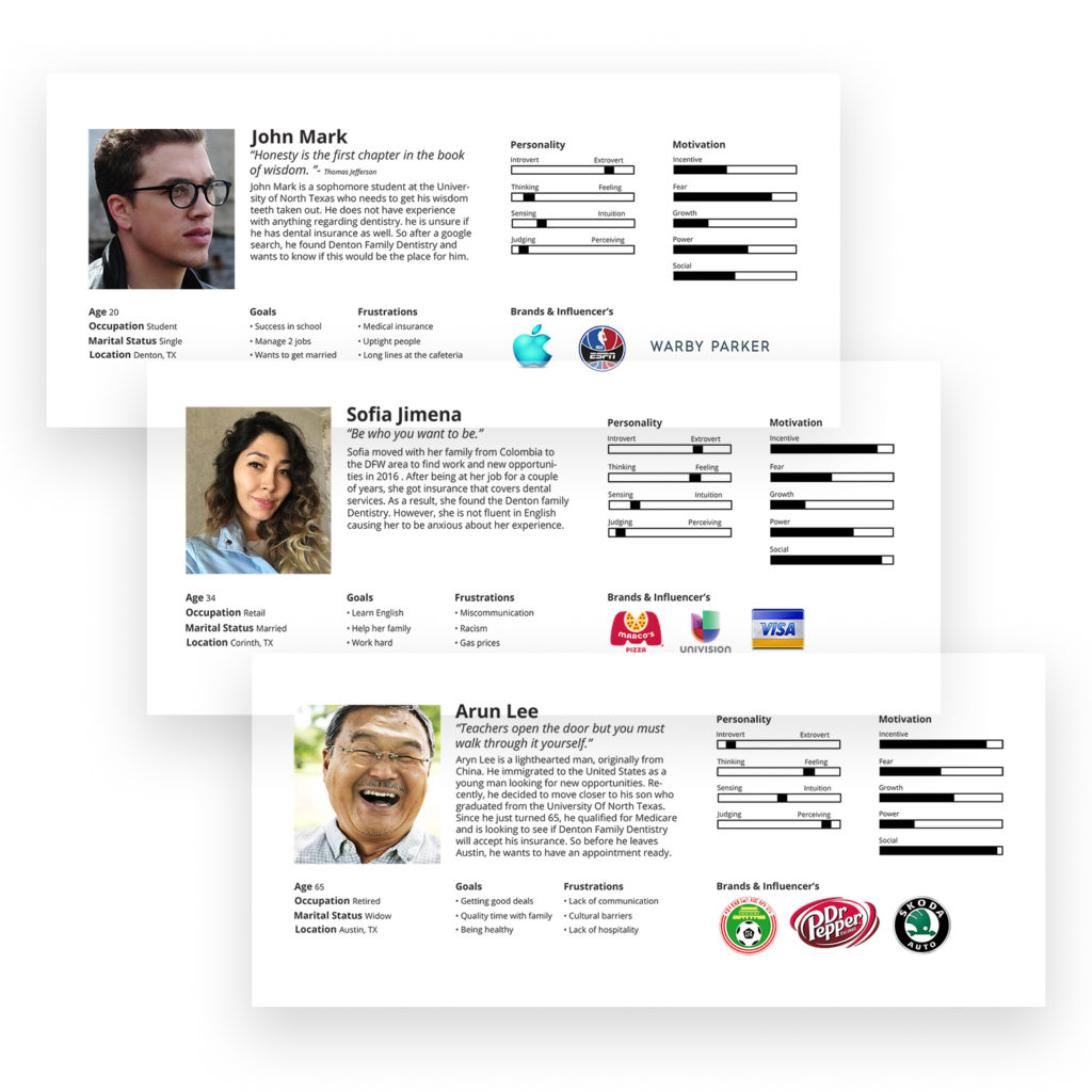
Personas
For this project, three personas were developed in order to better understand the target audience. They represented a variety of backgrounds so that our website would reflect the needs of all users. Our personas ranged from ages 20-65, were mostly looking for a new dentistry in Denton, and wanted to find more information on Denton Family Dentistry. This allowed us to understand our user’s needs, and keep them in mind when designing. These three personas were born out of the research done in the previous phase.
Task Flow
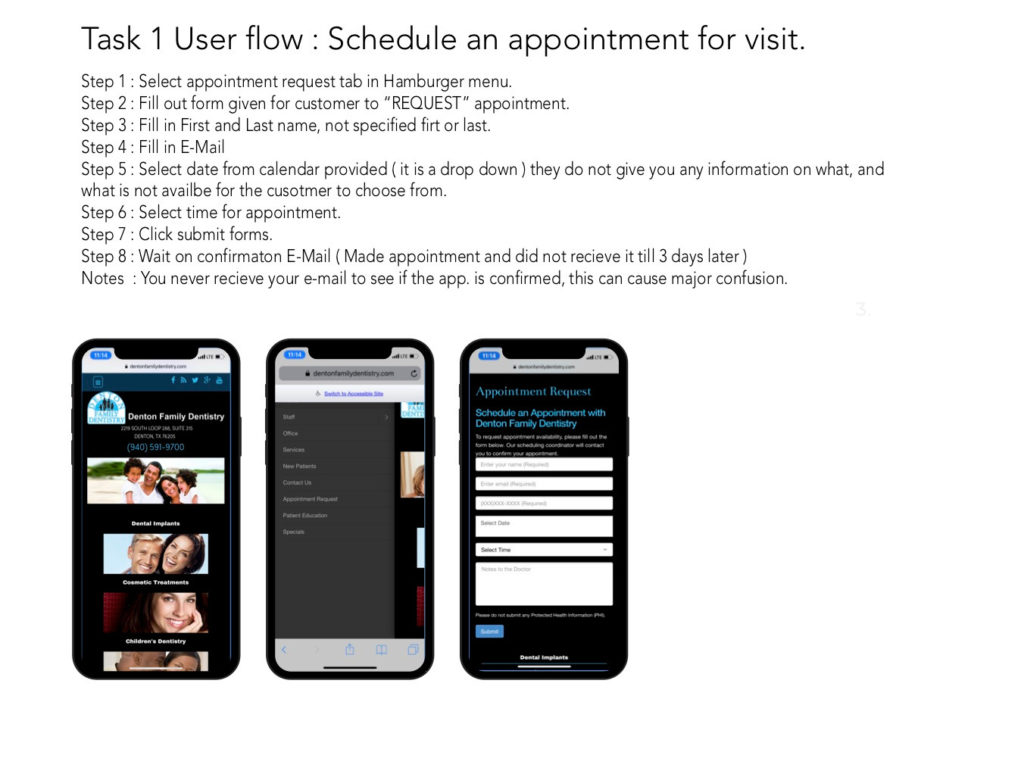
Performing the task analysis allowed ease in walking through the flow to identify the key screens necessary in understanding how Denton Family Dentistry users would book an appointment online.
Some key things we strived to understand:
- How they arrived at the site (for example, entering from Facebook or Yelp)
- How they navigate the site
- Their satisfaction with the process when they get the email appointment confirmation. Understanding this flow is vital to the creation of the user journey.
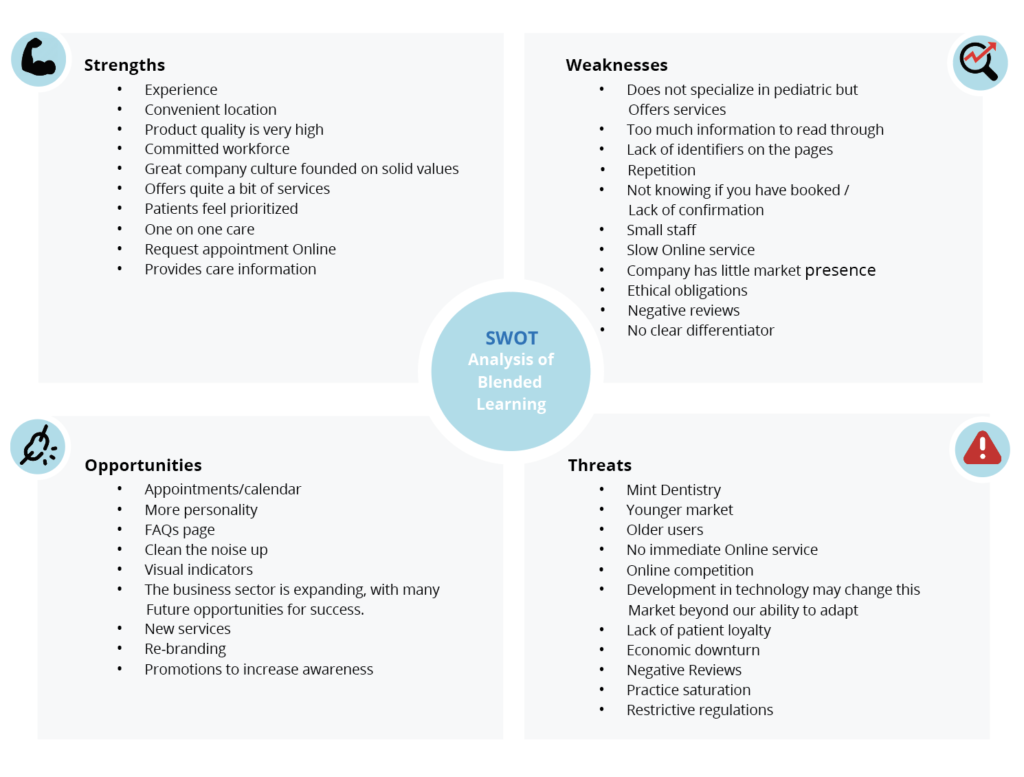
S.W.O.T Analysis
SWOT analysis to assess Denton Family Dentistry’s strengths, weaknesses, opportunities, and potential threats. The SWOT analysis helped to not only understand what was good and bad about the current website, but who potential competitors were, and what opportunities we could capitalize on when solutions presented themselves.
User Flow
Based on the previous task flow and what was learned about user habits, this flow defines John, Sofia, and Arun’s journey through the site, taking into account various decision points along the way. Click to View
Site Mapping
In redesigning the existing website, there is an advantage gained by reviewing the existing information architecture (IA). Ideally, the researcher would interview existing patients about the use of the site to get more insight into the architecture, but the pandemic restrictions interfered with the availability of testing participants. If those interviews were available, the resulting information architecture might have been different. It was the client’s wish to keep the IA largely the same as the old site, and without research data, it was difficult to make a compelling case otherwise. The main divergence from the old site is the restructuring and the amount of content on each page.
Sketches
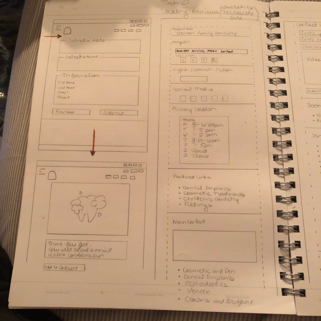
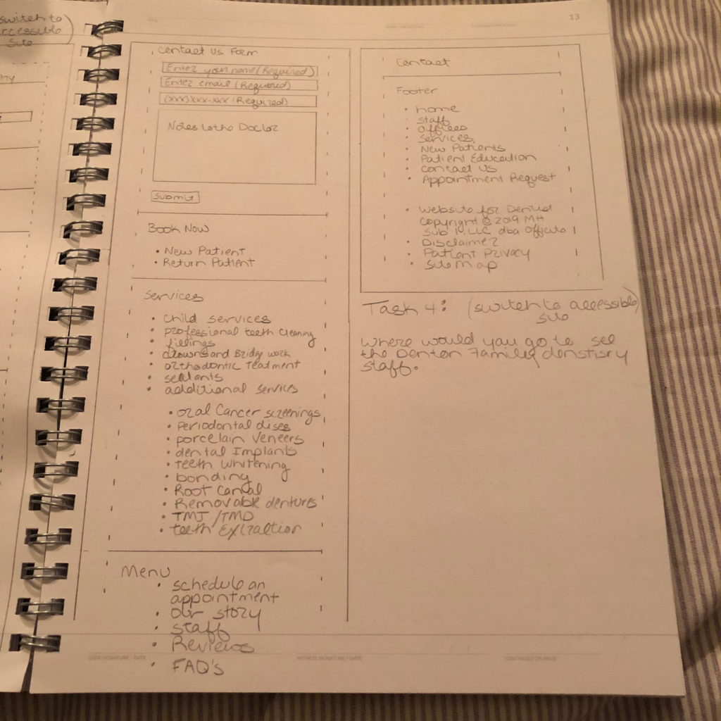
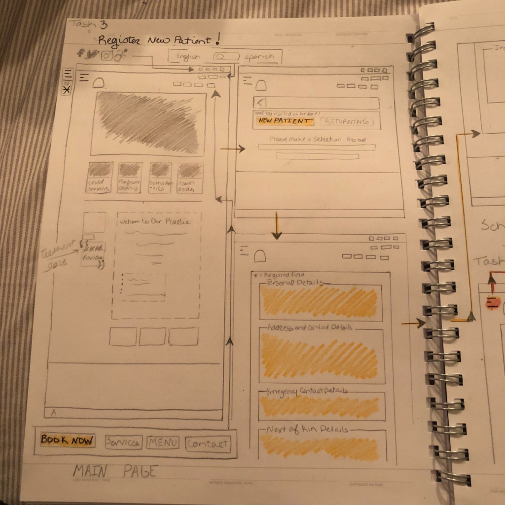
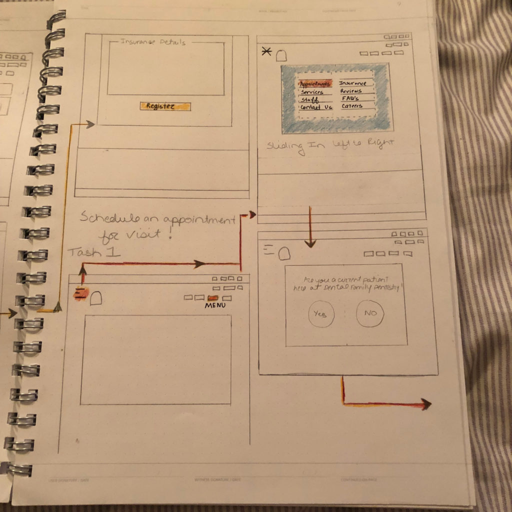
After sharing a competitive analysis of other websites with the client, and nailing down the site architecture, the basic look and feel of the site was defined. We wanted to keep it very loose and flowing preventing distraction with a lot of detail. This exercise allowed consideration of where content would fall on the page. Below is the homepage and its potential layout. Using sketches allows for quick iteration and generation of ideas. Click to View
DESIGN
Mood Board
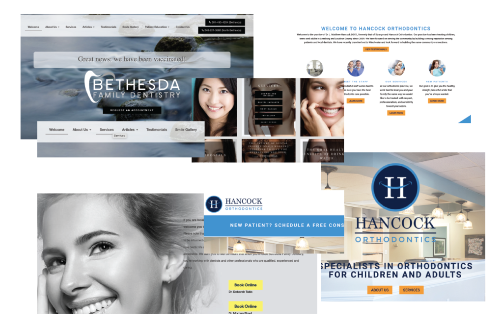
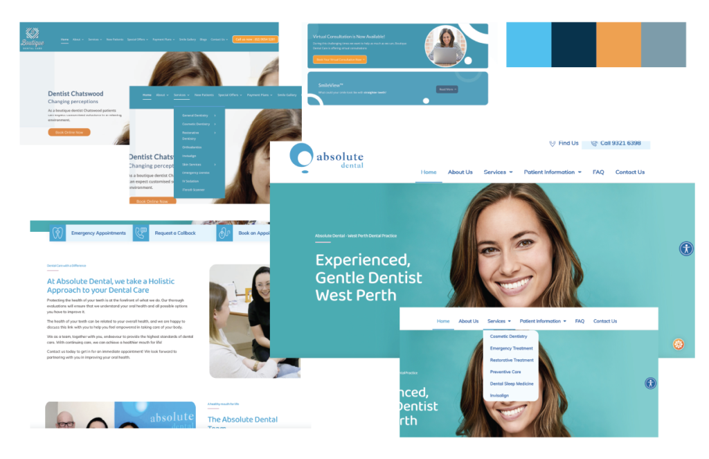
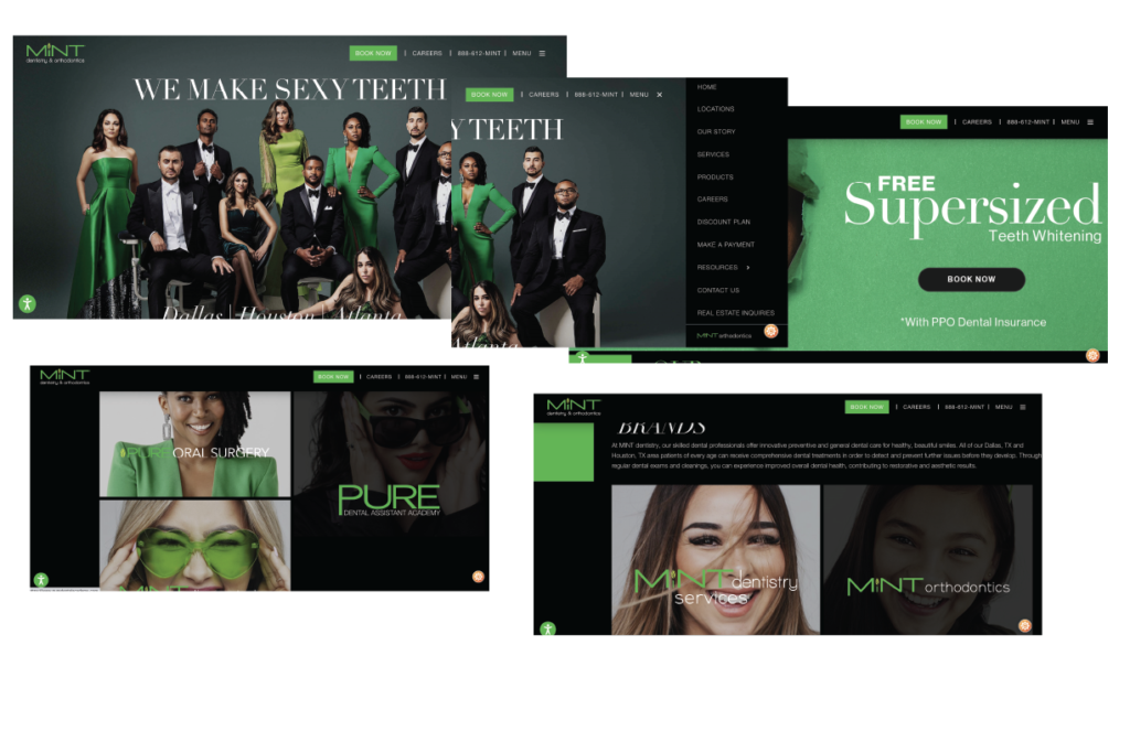
Inspiration to drive the creation of concepts for consideration. Potential colors, fonts/typography, textures, are all candidates for exploration. Various other dentistry sites were reviewed and collaged in an attempt to identify what elements elicited the desired emotional response in users. Feedback was compiled to identify what compilation produced feelings of calm or welcoming. Click to View
High Fidelity Prototype
The high-fidelity prototype is created in preparation for usability testing. First we define what we want to test and why. In this case, it will be our main task flow of booking a service using the online booking feature. The clickable prototype was developed using Adobe XD. Click to Interact with Prototype
Usability Testing
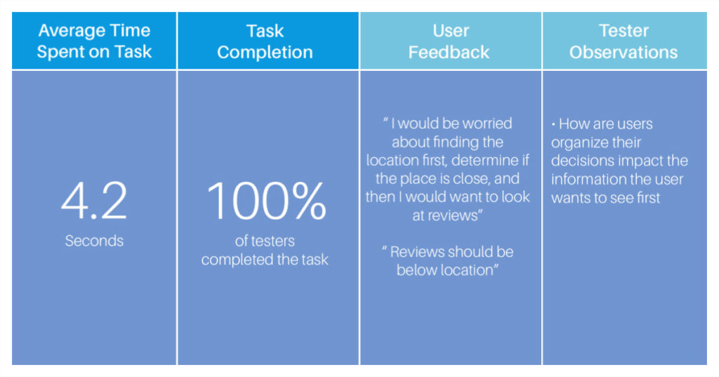
A test plan identifies what tasks the participant will be asked to complete, provides the user minimal instruction to measure the intuitiveness of the application, and guides the following interviews to explore the participant’s line of thinking. It is critical for the proctor to avoid “leading the witness” as it is important not to taint the organic response to the experience. Results are reported to the client, as they justify the revisions to the design. Click to View
Priority Revisions
From the testing results, changes to the prototype are prioritized. The paint points mentioned most often provide the “biggest bang for the buck” but might be more complex to make. Prioritization proceeds with lowest amount of effort but the highest rate of return. Ideally, testing occurs in an iterative environment. Changes are done quickly, in order to observe the impact of the changes with following participants.
Next Case Study:
“WIRED”
Now, Let's Talk About You!
If your organization sees the value in UX research and design use the button below for contact information to discuss opportunities or to just say hello!
